


How to create a button
Introduction
fastn language.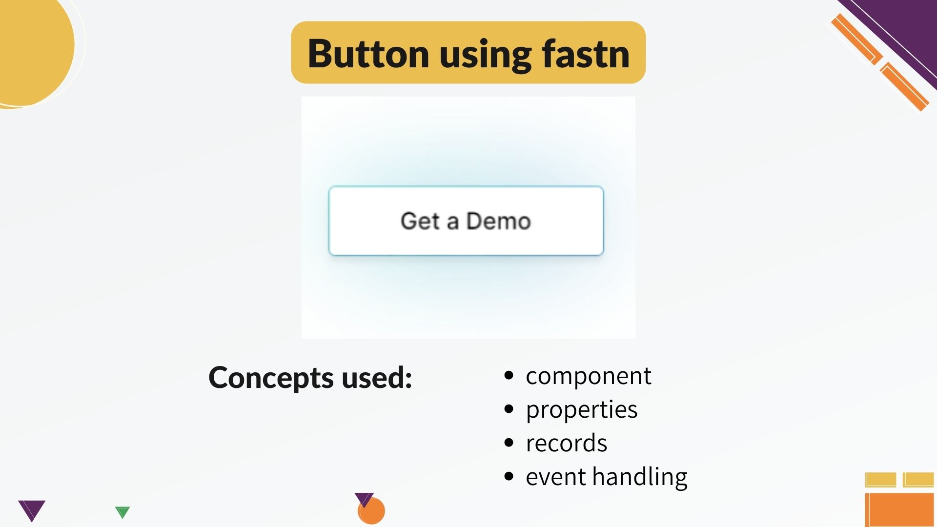
components.- To the component we will apply various properties with their respective
built-in types. Some of thePrimitive Typeslikecaption,string,booleanwhile others of theDerived Typeslikeftd.color,ftd.shadow. - We will use
recordsas well to define colors for both light and dark mode as well as shadow-color similar to what we have in second button. - We will do
event handlingthat gives shadow to the buttonon-hover.
Project buildup
component and we will call it button.
The syntax is:-- component button:
-- end: button
We will give the basic properties to this component like, title and link.
titleis ofcaptiontype.linkis ofstringtype.
optional, if you do not want to add any link to
it.-- component button:
caption title:
optional string link:
-- end: button
First, let's create one basic button.
Inside this component we will addftd.text that will take the title, a link
and apply the border property to it.-- ftd.text: $button.title
link: $button.link
border-width.px: 2
The dollars used here is for reference that the value in the caption of
ftd.text will come from component button's title and same for link.

ftd.text-- ftd.text: $button.title
link: $button.link
border-width.px: 2
padding.px: 10
border-radius.px: 6
min-width.fixed.px: 175
style: bold
text-align: center
After that, we will give color and role to the text.
For that, in the component definition we have added a variable text-color of
type ftd.color.
$inherited.colors to this variable. In
case, the user doesn't pass any text-color, while calling this component, it
will take the inherited color from the color-scheme.-- component button:
caption title:
optional string link:
ftd.color text-color: $inherited.colors.text-strong
-- end: button
ftd.text, we will pass the reference of text-color to the color.
And for the role we have passed as $inherited.type.copy-regular-- ftd.text: $button.title
link: $button.link
border-width.px: 2
border-radius.px: 6
padding.px: 10
min-width.fixed.px: 175
style: bold
color: $button.text-color
role: $inherited.types.copy-regular
role is a font specification which defines several font-related properties
like font-weight, line-height, letter-spacing etc. If you want to read
about roles you can checkout the ftd.responsive-type under built-in types.
The URL provided in the description below.
-- component button:
caption title:
optional string link:
ftd.color text-color: $inherited.colors.text-strong
ftd.color bg-color: $inherited.colors.background.base
ftd.color border-color: $inherited.colors.border-strong
-- ftd.text: $button.title
link: $button.link
border-width.px: 2
border-radius.px: 6
padding.px: 10
min-width.fixed.px: 175
text-align: center
style: bold
color: $button.text-color
role: $inherited.types.copy-regular
background.solid: $button.bg-color
border-color: $button.border-color
-- ftd.color monochrome-dark:
light: black
dark: white

-- ftd.color monochrome-light:
light: white
dark: black

-- ftd.color shadow-color:
light: #cae9ee
dark: #e4b0ac
These variables are of record type ftd.color. You can check the URL of
records to read about them.
ftd.shadow, which is also a record.-- ftd.shadow s:
color: $shadow-color
x-offset.px: 0
y-offset.px: 0
blur.px: 50
spread.px: 7
ftd.shadow and make it
optional-- component button:
caption title:
optional string link:
ftd.color text-color: $inherited.colors.text-strong
ftd.color bg-color: $inherited.colors.background.base
ftd.color border-color: $inherited.colors.border-strong
optional ftd.shadow hover-shadow:
-- ftd.text: $button.title
link: $button.link
border-width.px: 2
border-radius.px: 6
padding.px: 10
min-width.fixed.px: 175
style: bold
role: $inherited.types.copy-regular
color: $button.text-color
background.solid: $button.bg-color
border-color: $button.border-color
shadow: $button.hover-shadow
on-hover shows the shadow. So we will create a
boolean variable to component definition and create two events of
on-mouse-enter and on-mouse-leave.-- component button:
caption title:
optional string link:
ftd.color text-color: $inherited.colors.text-strong
ftd.color bg-color: $inherited.colors.background.base
ftd.color border-color: $inherited.colors.border-strong
optional ftd.shadow hover-shadow:
boolean $is-hover: false
$on-mouse-enter$: $ftd.set-bool($a = $button.is-hover, v = true)
$on-mouse-leave$: $ftd.set-bool($a = $button.is-hover, v = false)
shadow if { button.is-hover }: $button.hover-shadow
Component calling
-- ftd.column:
background.solid: white
width: fill-container
align-content: center
height.fixed.px: 280


-- button: Get a Demo
hover-shadow: $s
border-color: $shadow-color
text-color: $monochrome-dark
bg-color: $monochrome-light
link: https://fastn.com/expander


-- end: ftd.column
Closing remarks
There you go, we have polished the UI and it looks similar to our original UI with our own touch to it. I hope you have learnt with me and found this video easy to follow. If you like us, you can give us a ✨ on GitHub.
Also, we would love to see your package which you will create following this video. You can share it on the dicord's show-and-tell channel. Thank you guys.
